
Discover practical ways to find creative inspiration for illustration, design, and art, using movies, games, everyday life, and unconventional sources.
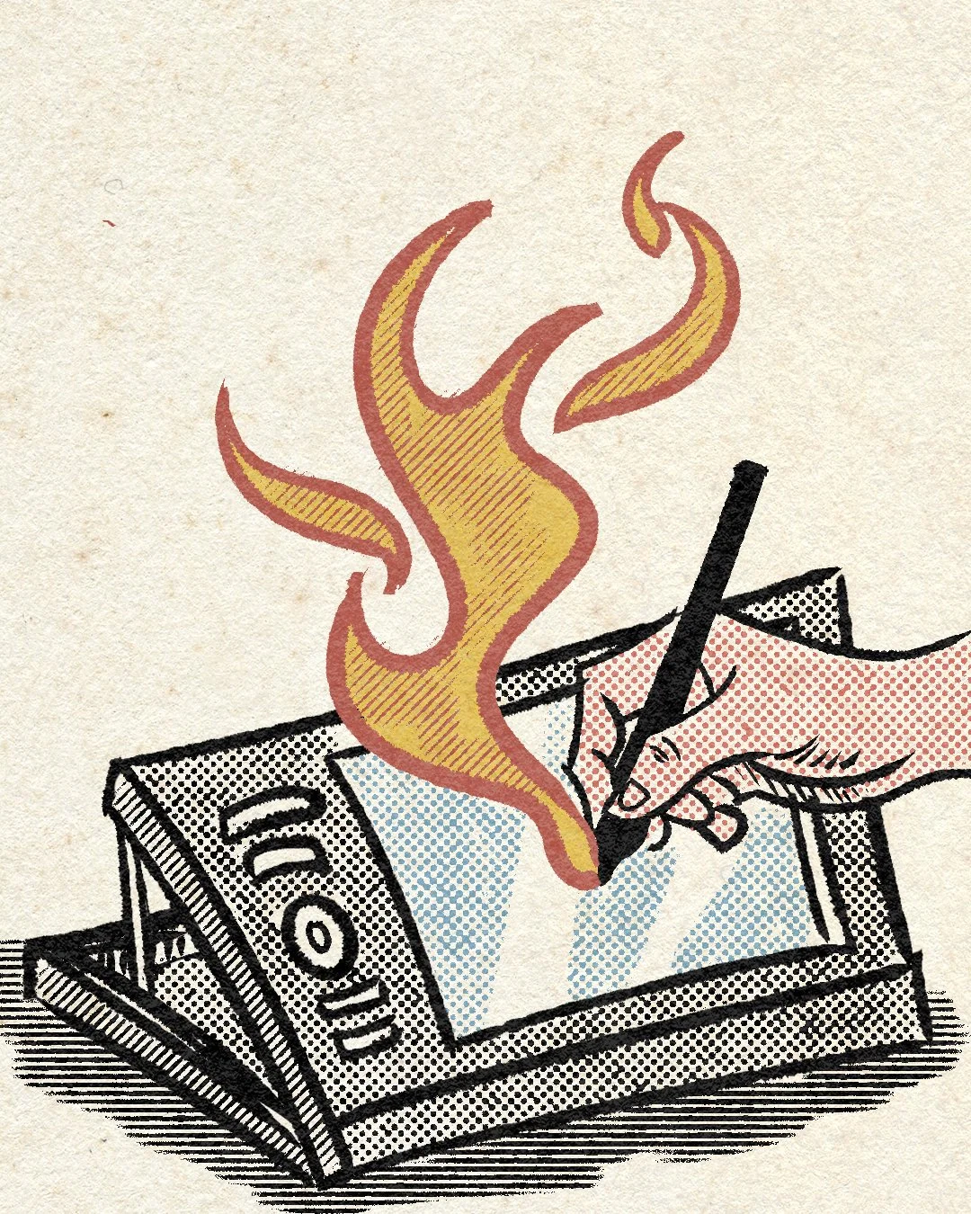
New coat of paint
As time goes on, my belly keeps growing if I don’t pay attention, and hangovers hit differently — which sucks. But I like to think there’s a silver lining to all of this: my artwork keeps evolving too.
Looking at some of my older designs feels like watching milk go sour before my eyes. Still, I can appreciate the original concepts and understand why I wanted to execute them the way I did back then. Now, with all the tools I’ve picked up over the years and started applying to newer work, it’s almost as if the older drawings got jealous and started demanding the same treatment.
So over the past couple of weeks, I gave a few of them a fresh new coat of paint — keeping the core idea, but redrawing everything: fixing perspective, anatomy, and typography where needed. In this post, I’ll break down the process behind a few of these redesigns.
Let’s start with one of my very first commissions — a poster for a weekly jam session in my hometown of Guimarães.
Back in 2018, I had just returned from living in London for five years. Fresh out of uni, I was hungry to start building a proper portfolio. At the time, the city had four or five weekly jam sessions, mostly featuring musicians playing Pink Floyd and Guns N’ Roses covers with impressive dedication to accuracy and perfection.
Then, one random Saturday night, I stumbled upon a jam session run by 17-year-old kids in a tiny pub tucked away in a narrow alley. People were just jamming, clamming, and butchering mainstream songs — and I loved it. That’s what a jam session is supposed to be!
I immediately spoke to the organisers and the pub owner and pitched the idea of doing a poster to promote the event. From the start, I had a clear visual in mind. The session was hidden in a small corner of the city, barely known to anyone. But when I sketched out the main street leading into the alley and showed it to my family, they instantly recognised the place. "Just turn right there — and you’re in!"
The first version of the drawing was done in a Moleskine sketchbook. I traced it with fineliners, scanned it, image-traced it in Illustrator, and painted it digitally in Photoshop using a colour palette that felt right for a jazzy jam night out.
And voilà.
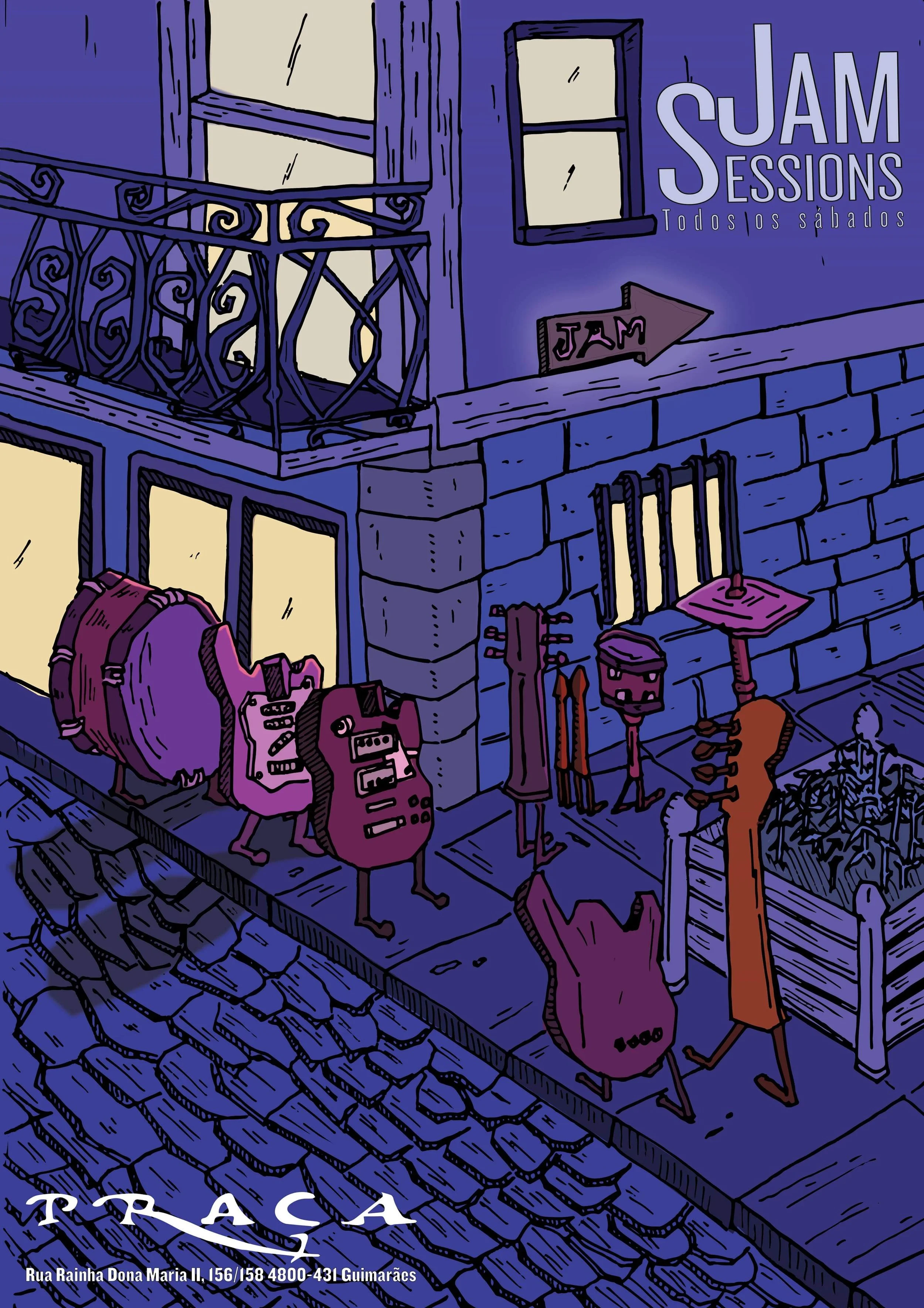
Initial design
Fast forward to 2025 — I’ve now worked with a handful of clients, designing everything from metal album covers to illustrating children’s books (and plenty in between). Like a character in an RPG, I’d like to believe I’ve levelled up at least a little.
I still liked the original idea, but I wanted to give it an upgrade — not just because I’ve improved, but because my newer work includes brushes and textures that the older pieces never had access to. I could almost hear them crying out for attention, so I got to work on a solution.
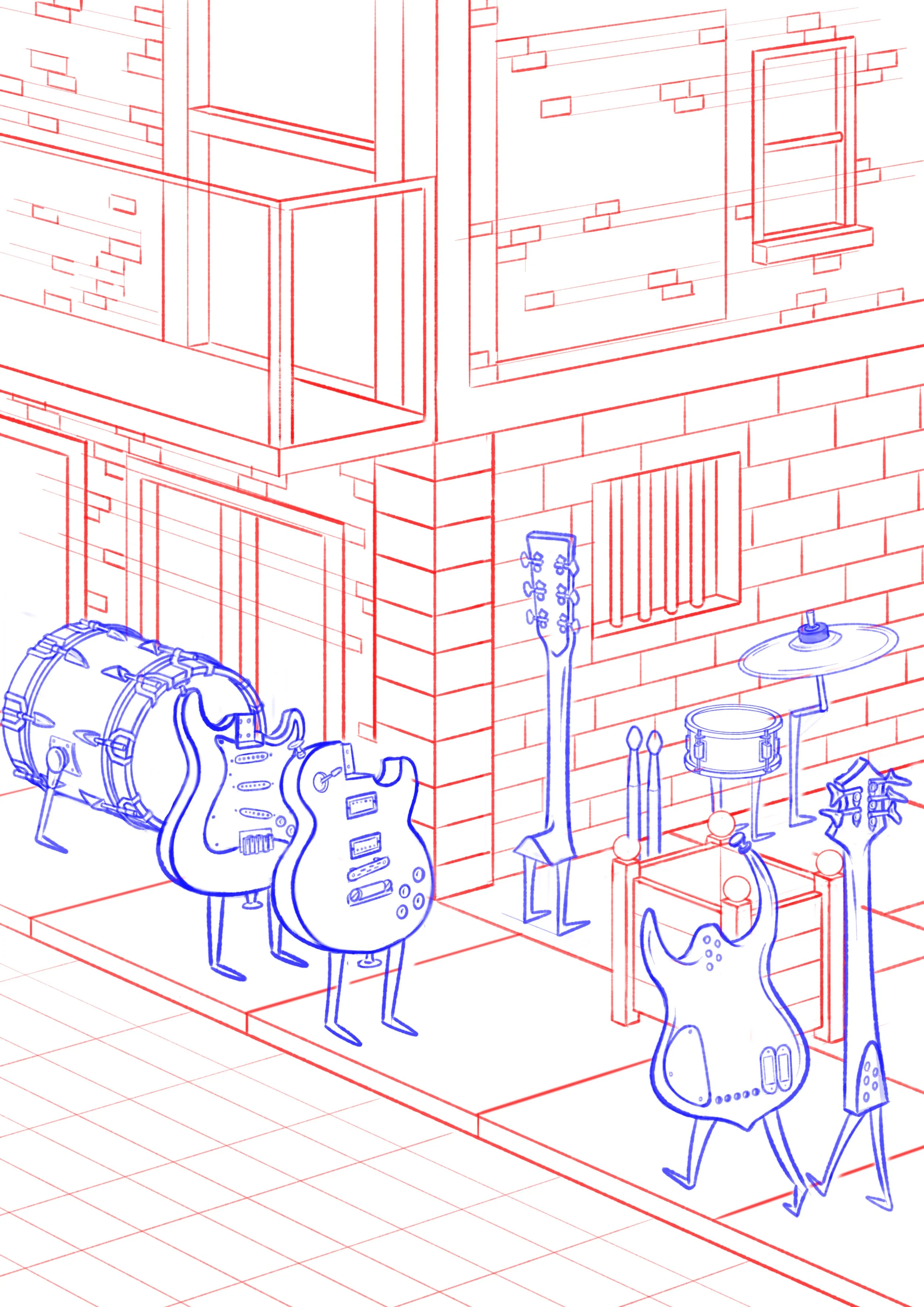
Line sketch of the remake
The first step was to draw over the original composition and fix the wonky perspective. Being a musician myself, I felt the need to do justice to the instruments and give them a bit more detail and structure.
The entire sketch was done in Sketchbook Pro — the software gives me a relaxed, paper-like drawing experience that feels close to traditional drafting. Once that was done, it was time to trace over the image.

Trace over the sketch
Once the sketch was complete, I traced over it in Adobe Photoshop using brushes I purchased from True Grit Texture Supply. For the main linework, I used the Rusty Nib pack — it gives the artwork a rustic feel, like an old chisel that’s etched over a thousand drawings and only gets better with age. For shading and details like crosshatching and halftones, I used the Beat Tones pack.
I really like the versatility these brushes offer, especially how they allow me to mix different textures when I want to darken or emphasize a specific element.

Final image
At last, it was time to add the final layer of paint — literally: colouring the drawing. I wanted to keep the colour palette similar to the original, but after working for a screenprinting company, I realised that, in most cases, you don’t need more than five colours in an illustration. If you need an extra one, you can usually achieve it by mixing two of the existing colours with halftones — and from a distance, you can barely tell it’s not a separate colour.
Not all of my work is meant for screenprinting, of course, but I find that adopting this philosophy of limiting the colour palette is a great exercise — not only because I might screenprint the piece one day, but also because it helps keep the composition consistent and easier on the eyes.
Now, let’s move on to another piece I had a ton of fun remaking. Back in 2020, one of my best friends told me — last minute — that he was going to do a Black Metal DJ set at our friend’s brewery and asked if I could whip up a quick poster or montage. But instead of doing a basic cut-and-paste job, I wanted to create something a bit more original.
So, I sketched a cultish gathering on a piece of paper, added a mortified chicken sitting over a pentagram, and thought: yeah, this feels right.
Strangely enough, the idea actually worked. The composition and colour choices held up over time, and I could look back on it without cringing... too much. But the actual drawing and execution? Yeah, that part definitely left a lot to be desired.
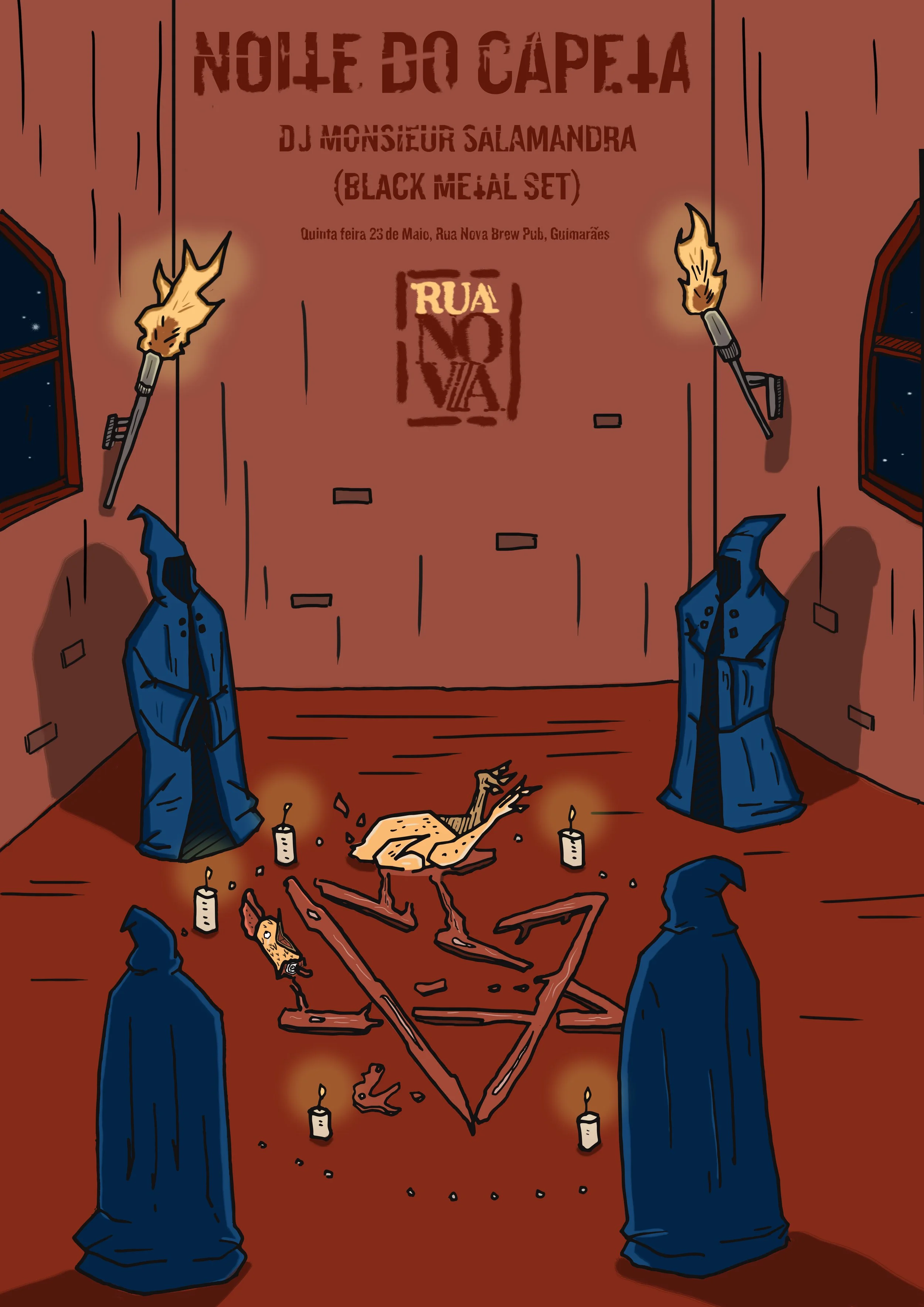
Original Black Metal Night poster
Riding the “remake everything” wave, I looked at this piece and knew I wanted to give it the same treatment as the other posters. Around that time, I had also rewatched one of my favourite animated films — Heavy Metal (1981) — and couldn’t stop thinking about the scene where a hooded cult is about to sacrifice someone to a cosmic deity.
That moment stuck with me and ended up inspiring the direction I wanted to take with this redesign.
It was time to start sketching.

Sketch for the Black Metal Night remake
Once again, the priority was to fix the weird perspective on the wall and give the figures more detail and definition. As I mentioned earlier, I drew a lot of inspiration from Heavy Metal (1981) — particularly the scene where a hooded cult attempts to sacrifice a woman to a cosmic deity.
One of the perks of working digitally is being able to use different colours for different elements during the sketching phase, which helps avoid confusion when refining the details. Once the sketch was complete, it was time to trace over it.

Once again, the tracing was mostly done using the Rusty Nib pack from True Grit Texture Supply, with shading handled by the Beat Tones pack. I really love the Beat Tones set — it lets you create beautiful shadow effects in a matter of seconds, saving you from spending hours manually drawing endless wavy lines.
With the linework finished, it was time to move on to the colours.

Black Metal Night complete remake
And once again, colour wasn’t an issue in the original drawing — in fact, I was quite happy with it. I also replaced the generic typeface with Blackaxe from Mighty Short, giving the poster a subtle medieval vibe, while keeping it simple enough for easy reading. The torches got an upgrade too: instead of using a generic paintbrush, I applied a halftone brush from the Beat Tones pack on top of the linework. A simple technique that instantly makes a huge difference, using only one colour.
The cherry on top was the Modern Pulp texture, again from the Infinite Pulp pack by True Grit Texture Supply.
I’ve done other remakes of old posters, but if I were to break down all of them here, I wouldn’t be creating new original work — I’d be broke and begging for pennies under a bridge. And I’m sure you, dear reader, have better things to do as well.
So, without further ado, if you’d like to see more of my work, head over to the Artwork section of my website and check it out.
Thanks for sticking around this far — keep an eye on this blog, as more posts are coming soon.
Cheers to y’all,
Vitor